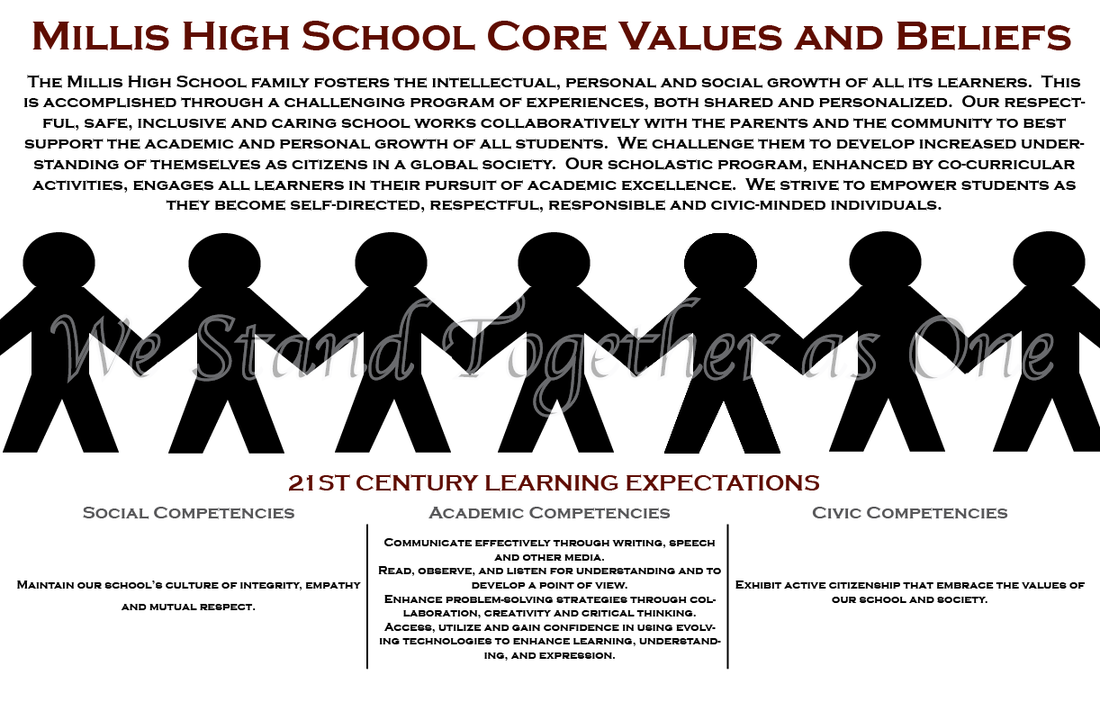
 This is my core values poster that I collaborated on with Janette Elizabeth Truchon on. This poster represents and tells what Millis High School stands for. Janette's speciality while creating this was retrieving the perfect picture off the google machine.
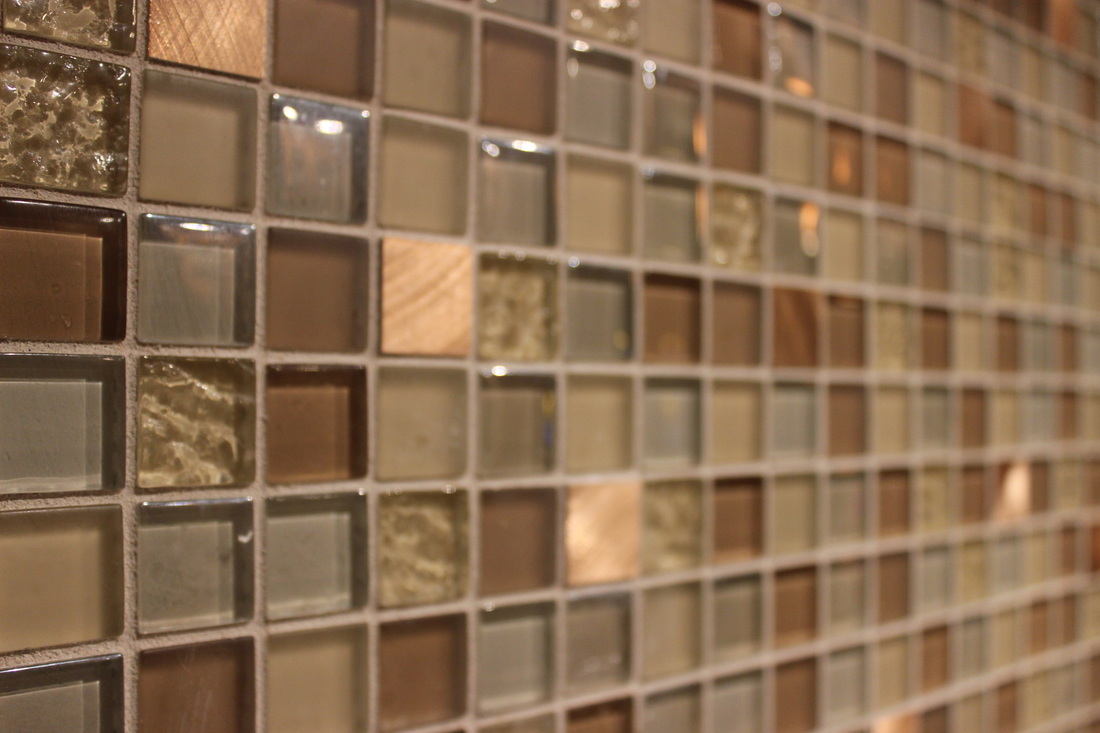
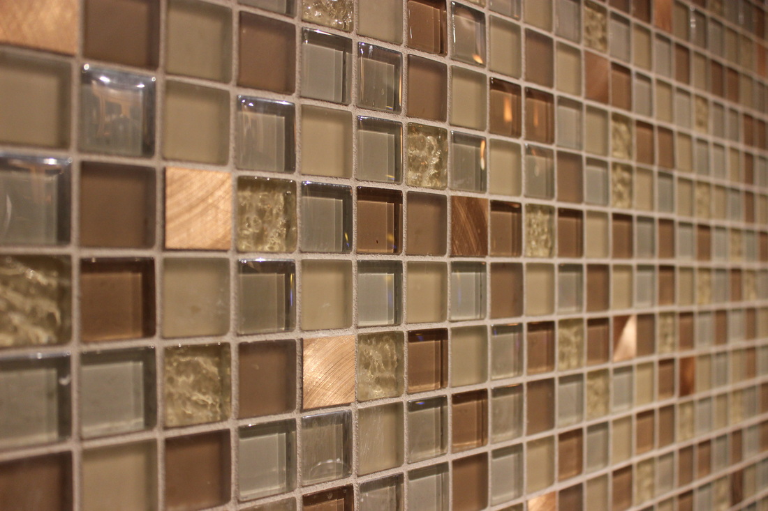
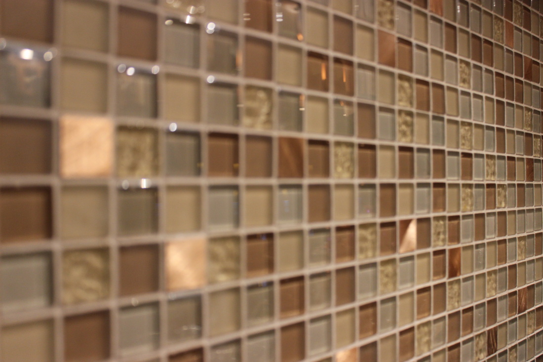
This project was designed to demonstrate our knowledge of depth of field. I wanted to do three of the almost exact same image to display the dramatic illusion it creates for the eye. The pictures are not identical but the places in focus impact and add lots of drama in different ways to each of the photos. By far in my opinion one of the most useful and valuable strategies I've learned so far.
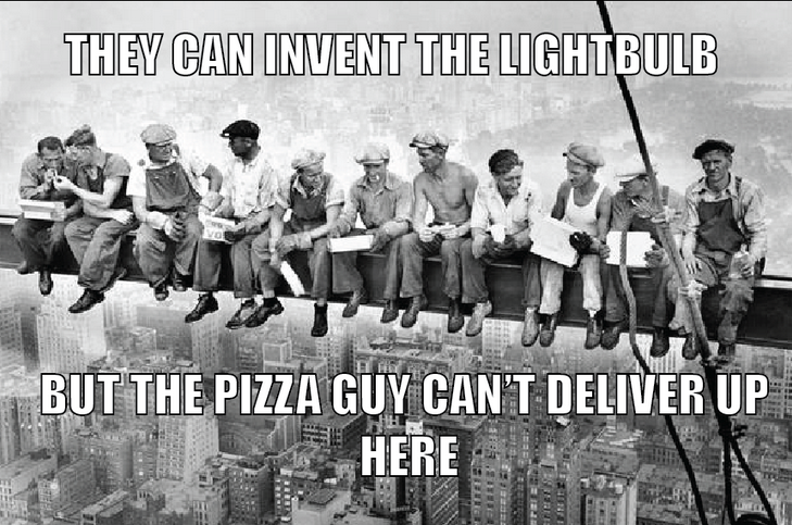
The meme challenge was a really fun way to experiment with formatting in a picture as well as with different fonts and how things look. This also allowed us to be able to collaborate a different kind of artistic creativity with adobe illustrator.
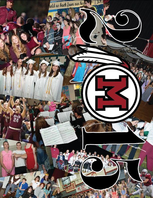
For my yearbook cover I wanted it to be something very personal as well as sophisticated. I put pictures that are from a variety of activities around the school. I thought that my yearbook cover looked to cluttered when it initially had the full MHS title, so I made the zero in 2015 the mohawks logo. I thought this added a lot of emphases and just made it different than in years past.
|
AuthorMillis High School Class of 2017 
Archives
June 2015
Categories |
 RSS Feed
